The Coca-Cola bottle: 110 years of curves, with not a wrinkle in sight!

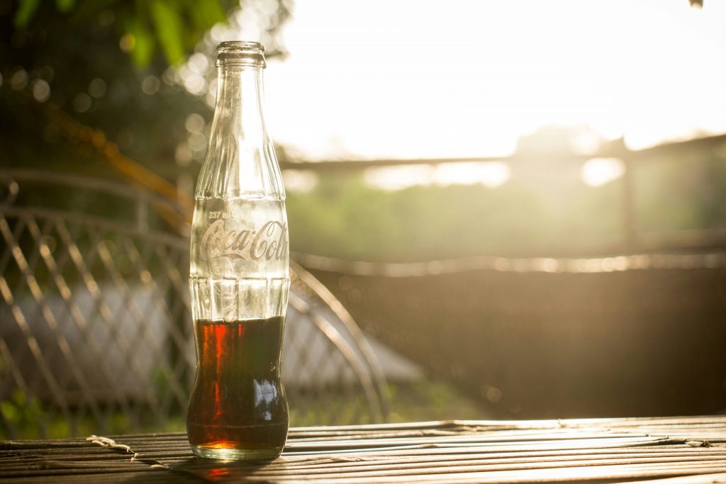
It fits in the hand like no other. Recognisable to the touch and identifiable even when shattered on the ground, it has become one of the most universally recognised objects in the history of industrial design in just over a century. Born from a 1915 competition in a small Indiana town, it has made its way from American bar counters to the walls of contemporary art museums. It has weathered wars, fashions and materials, never losing its silhouette. A look back at an object unlike any other.

Before the curve came chaos

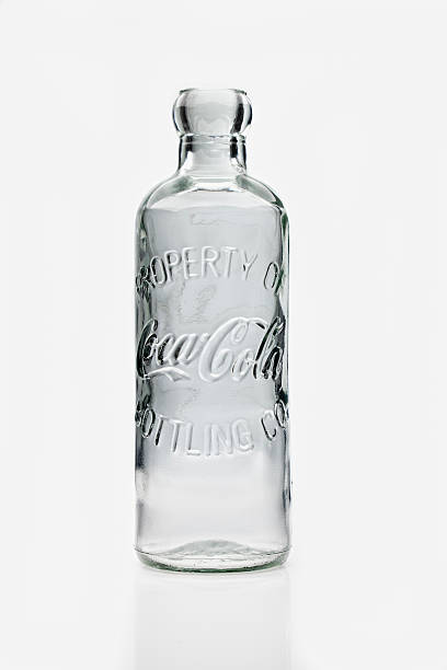
1899-1902 Hutchinson héritage de bouteille de coca-cola – iStockPhoto

When pharmacist John Pemberton invented the Coca-Cola formula in Atlanta in 1886, the drink only existed as a syrup served in pharmacies’ soda fountains for five cents a glass. Eight years later, in 1894, a confectioner from Vicksburg, Mississippi named Joseph Biedenharn decided to bottle the drink for the first time. He used Hutchinson bottles: generic, straight-sided containers with metal caps that were used interchangeably for all sorts of sodas. It was the sound of the cap popping open that actually gave rise to the expression ‘soda pop’. In 1899, the national bottling rights were sold for the modest sum of one dollar to two lawyers from Tennessee. The drink’s success was meteoric, but a problem arose: dozens of imitation brands with barely disguised names — Koka-Nola, Toka-Cola and Ma Coca-Co, for example — flooded the market in identical bottles. The urgent need for a distinctive container became a matter of commercial survival.

The competition, the cocoa pod and the sleepless night

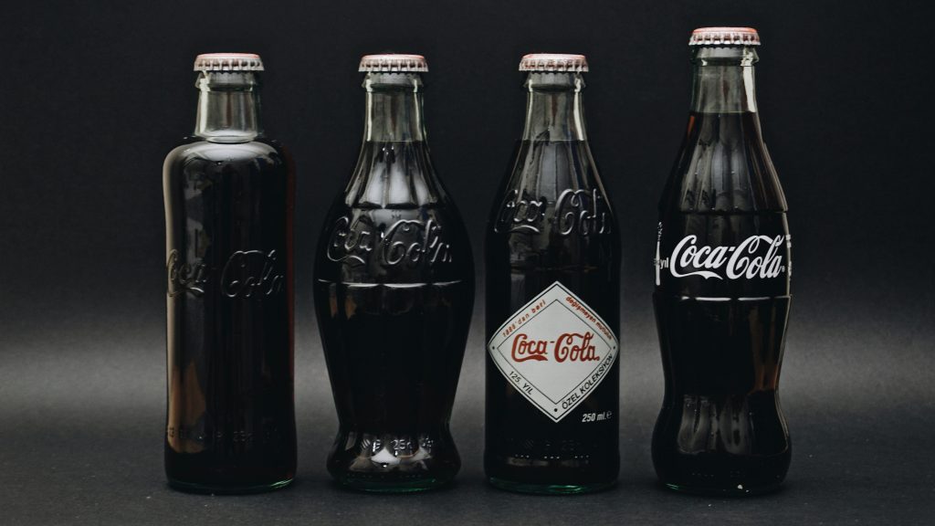
Berke Can – Pexels

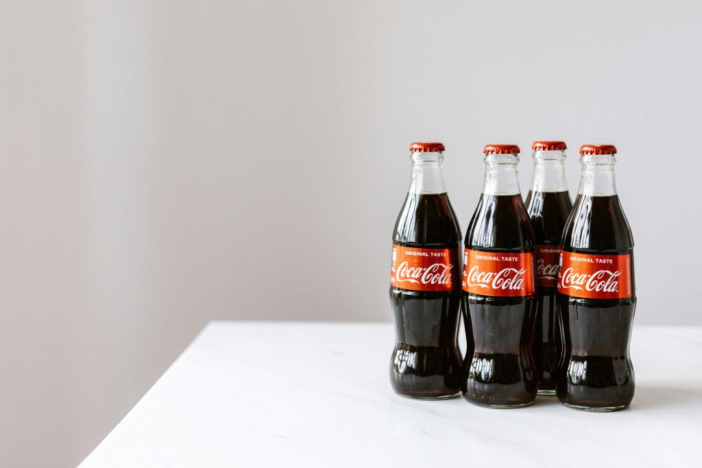
On 26 April 1915, the Coca-Cola Bottling Association directors launched a competition among a dozen American glassmakers. The brief could be summed up in a single legendary sentence: ‘Design a bottle so distinctive that it could be recognised by touch in the dark or when broken on the ground.’ The prize money amounted to five hundred dollars. In Terre Haute, Indiana, the team at the Root Glass Company got to work. Designers Earl R. Dean and Clyde Edwards visited the municipal library to seek inspiration. They came across an illustration of a cocoa pod with an elongated shape and pronounced ridges. Dean sketched a bottle inspired by these curves, then worked through the night to produce a glass prototype before the furnaces were shut down for the season. The patent was filed on 16 November 1915, with no mention of the name ‘Coca-Cola’ in order to protect the sponsor’s secret.

The birth of a universal silhouette

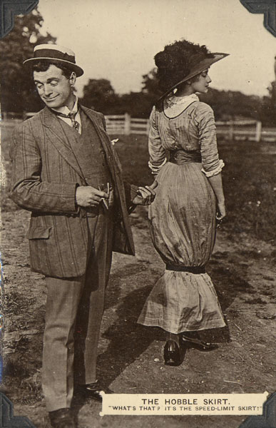
Hobbleskirt ; Wikimedia

In early 1916, a committee of bottlers and company executives selected the design by Root Glass from all the entries submitted. The original prototype was too bulbous for the bottling lines of the time and was refined over the summer to produce the slimmer silhouette recognised around the world today. The contract specified tinted glass known as ‘Georgia Green’, in homage to the company’s headquarters in Atlanta. As soon as it was released, the ‘contour’ bottle — nicknamed the ‘hobbleskirt’ in reference to the restrictive skirts popular in the 1910s — stood in stark contrast to competitors’ straight-sided bottles. In 1923, Coca-Cola developed the six-pack — a novel format designed to encourage home consumption — made possible by the increasing prevalence of refrigerators in American households. The bottle left the bar counter and entered the kitchen.

From the bar to the museum: cultural recognition

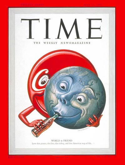
Crédit TIME

In 1950, the Coca-Cola bottle became the first commercial product to appear on the cover of Time magazine. The story goes that the editorial team wanted to photograph the company’s legendary founder, Robert Woodruff, but he refused, believing that the brand mattered more than the man. A study conducted a year earlier had already revealed that nearly 99% of Americans could identify the bottle by its silhouette alone. In 1961, it was granted trademark status — an extremely rare privilege for a simple piece of packaging. The following year, Andy Warhol made it the subject of his first pop art silkscreen prints. His 1962 painting Green Coca-Cola Bottles, which features 112 green bottles lined up on a canvas and is now held at the Whitney Museum in New York, propelled this everyday object into the artistic sphere. Warhol saw it as a symbol of absolute equality: the same bottle for everyone, from the president to the passer-by.

The curve persists, from glass to plastic

Ali Dashti ; Pexels

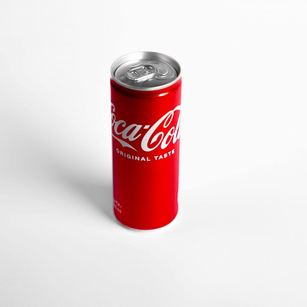
For decades, the Contour bottle was made exclusively of glass in its traditional 6.5-ounce (approximately 19 cl) size. It was not until 1955 that new sizes first appeared in the form of the King Size and Family Size bottles. The introduction of aluminium cans in the 1960s presented a new challenge: reassuring consumers accustomed to glass bottles. The solution was to print the Contour silhouette directly onto the metal. Then came the PET (polyethylene terephthalate) revolution of the 1970s, which enabled the production of lightweight yet durable plastic bottles. The 1.5-litre PET bottle was introduced in France in the early 1990s. The material changed, but the shape remained the same. Coca-Cola ensures that the Contour silhouette is reproduced on every new container, from plastic to aluminium, guaranteeing a visual consistency that few other brands can claim to have.

The sustainability chapter: recycling without losing the soul

Kaboompics ; Pexels

At the turn of the 2000s, environmental concerns came to the fore in the packaging industry. In 2009, Coca-Cola launched the PlantBottle: a PET bottle made partly from plant-based materials, notably sugarcane. The first version contained 30% renewable materials. In 2015, a fully plant-based prototype was unveiled at the Milan Expo. At the same time, the company invested heavily in recycled PET (rPET) and in reducing the weight of its packaging, achieving a reduction of over 30% in the weight of certain formats within a decade. In France, Infineo, a joint venture based in Burgundy, produces 48,000 tonnes of high-quality recycled PET each year for use in manufacturing new bottles. From glass to plant-based plastic, the bottle has adapted to the demands of each era without compromising on the defining feature it has had since 1915: its unforgettable curve.

The Coca-Cola bottle: an inexhaustible source of inspiration!

Wikimedia

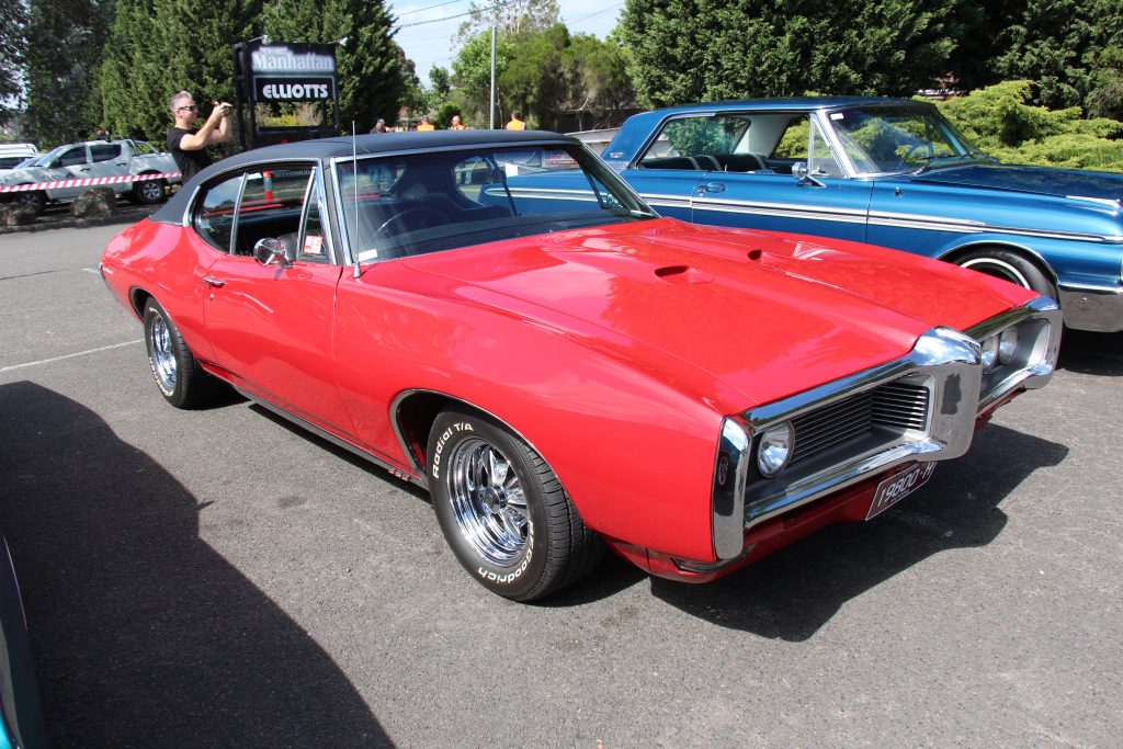
Its influence extends far beyond soft drinks. The Contour silhouette didn’t just sit quietly on a grocery shop shelf. As early as 1943, Salvador Dalí incorporated it into his painting Poetry of America, becoming the first artist to recognise the bottle as a cultural symbol — long before Warhol. In cinema, the South African film The Gods Must Be Crazy (1980) hinges on the bottle as the catalyst for the entire plot. However, the influence is perhaps most unexpected in the automotive industry. In the late 1960s, Detroit designers adopted a body style inspired by the bottle, with bulging wings at the front and rear and a narrow waistline in the centre to create a ‘wasp waist’, as seen on the Buick Riviera, the Pontiac GTO and the Chevrolet Camaro. The term ‘Coke bottle styling’ entered the official vocabulary of automotive design. As for the bottle itself, it found its way into New York’s MoMA, where it is recognised as a major milestone in the history of packaging. In turn, it was nicknamed ‘the lady in the black sheath’ or ‘the Mae West bottle’, in homage to the actress’s curves. Few industrial objects can boast having inspired masterpieces, muscle car bodywork and a cult film all at once.

Continue exploring

From the gavel to the click: auctions
Julien Lachaud’s ‘Nuances’ sideboard: sycamore takes on a blue hue
Mindmade : furniture by Youssef Benhamou
The story of a bold French company: from Q de Bouteille to QDB Éditions
Gastronomy and craftsmanship: the anatomy of the perfect bite
Michelin Guide : How a tyre manufacturer became the ultimate judge of the world’s best cuisine

Février, 2026

Édition 3 : Patrimoine et création

Créer avec l’existant, penser avec l’histoire

De l’architecture au design, cette édition explore comment lieux, savoir-faire et matières héritées deviennent terrains de création actuelle.

Janvier, 2026

Édition 2 : Quiet luxury

Le luxe se réinvente.

Finis les logos clignotants, place à une sobriété raffinée, à l’immersion personnelle, à l’excellence artisanale, à la durabilité sensible.

Décembre, 2025

Édition 1 : Le sens de la fête

Héritages, gestes contemporains et plaisirs essentiels

Parce que la fête n’est jamais qu’apparence : elle reflète notre manière d’habiter le monde, de transmettre, de fabriquer des souvenirs durables.

ÉDITION #3

Révéler la beauté

Upcycling et kintsugi transforment l’objet contemporain, faisant de la trace, de la réparation et de la matière un langage esthétique.

ÉDITION #3

Les nouveaux artisans du patrimoine

Artisans et designers donnent une seconde vie aux matériaux anciens, entre création contemporaine, patrimoine et réemploi.

ÉDITION #3

L'art à la rescousse des friches et lieux oubliés

Bunkers, wagons et kiosques renaissent grâce à la création, révélant comment l’art redonne sens aux lieux délaissés.

ÉDITION #2

Le murmure du beau

Un regard transversal sur le quiet luxury à travers des lieux, des objets et des figures qui expriment l’élégance.
ÉDITION #1

Lieux, maisons et matières en éclats

Une sélection de marques, architectures, objets et escapades qui donnent corps au sens de la fête.

ÉDITION #3

La création au secours des bâtiments promis à l’oubli

Usines et gares délaissées deviennent lieux culturels ouverts, où mémoire industrielle et usages contemporains redessinent la ville.

ÉDITION #3

Hôtel Normandy Le Chantier

L’audacieuse métamorphose d’un palace parisien

ÉDITION #3

Dans les coulisses du Centre d'Études Picasso à Paris

Au cœur du Marais, un lieu discret révèle comment archives, architecture et recherche font dialoguer l’œuvre de Picasso.

ÉDITION #2

Shopping iconique dans un décor Tudor

Une expérience shopping unique dans un magasin emblématique.

ÉDITION #2

Gastronomie et architecture

Voyage culinaire et architectural au cœur de la Seine

ÉDITION #2

L'art de l'hospitalité parisienne

Dans le 9e arrondissement, un établissement qui invite au quiet luxury

ÉDITION #1

Chante!

Chante! vient d’ouvrir ses portes. Une invitation à vibrer !

ÉDITION #3

La boîte aux lettres française devenue objet de design

Icône du paysage français, la boîte jaune change de statut et s’invite dans l’univers du design.

ÉDITION #3

Retour sur Maison&Objet 2026 : retour aux sources et à l’essentiel

L’édition 2026 affirme une vision où artisanat, design et mémoire façonnent l’habitat contemporain, international actuel.

ÉDITION #3

Art Deco: un mouvement centenaire, plus actuel que jamais

Cent ans après 1925, l’Art déco revient dans nos villes et intérieurs avec géométrie, audace, optimisme.

ÉDITION #3

Royal Limoges, deux siècles d’histoire au présent

Depuis plus de deux cents ans, Royal Limoges conjugue porcelaine, savoir-faire industriel et création contemporaine.

ÉDITION #3

Du terrain à la rue et au catwalk : les sneakers à travers les époques

Des terrains de sport aux podiums, la sneaker raconte un siècle de mutations culturelles, techniques et stylistiques.

ÉDITION #2

La formidable aventure du papier peint de luxe

Design, mode, artisanat : des créations où la forme et la matière se répondent avec justesse, loin de tout effet de mode.

ÉDITION #1

Icônes, détails, rituels

Décorations artisanales, calendriers ultra-luxe et pièces de collection pour s’enivrer de joie avant l’heure.

ÉDITION #3

Anton Laborde

Entre marqueterie monumentale et jungle symbolique, Anton Laborde transforme le bois en récit contemporain poétique engagé.

ÉDITION #3

Thierry Laudren

À Maison & Objet, Thierry Laudren présente des meubles sculptés où fonction, matière et lenteur façonnent une présence.
ÉDITION #3

Jean Nouvel

Jean Nouvel conçoit une architecture attentive aux contextes, où lumière, histoire et usages façonnent chaque projet.

ÉDITION #3

Sophie Morel

À Lyon, Sophie Morel rénove des lieux historiques en alliant respect du bâti et écriture contemporaine.
ÉDITION #3

Pascal Grasso

Au Centre d’Études Picasso, l’architecte compose une architecture où lumière, géométrie et héritage dialoguent avec précision.
ÉDITION #2

Alexandre Danan

Entretien avec le fondateur d’EDO (European Design Office)

ÉDITION #2

Aziz Temimi

Portrait d’un visionnaire qui transforme l’art de recevoir en expérience totale.

ÉDITION #1

Visages, gestes, inspirations

Personnalités, artisans et créateurs qui donnent à la fête sa profondeur humaine.

ÉDITION #3

Chemins de traverse : parenthèse d’exception en Bordelais

De Bordeaux au Bassin, art, vignobles et bien-être composent une échappée élégante au cœur de la Gironde.

ÉDITION #2

Voyage en Toscane

Vers une région de l’Italie habitée par le temps, où paysages, culture et usages s’accordent dans une continuité rare.

ÉDITION #1

Horizons, saisons, traditions

Destinations et rituels qui réinventent la fête, du soleil tropical aux marchés d’hiver.

Dates, adresses, invitations

Expositions, événements et repères culturels pour vivre pleinement la saison des fêtes.